Eric Image 1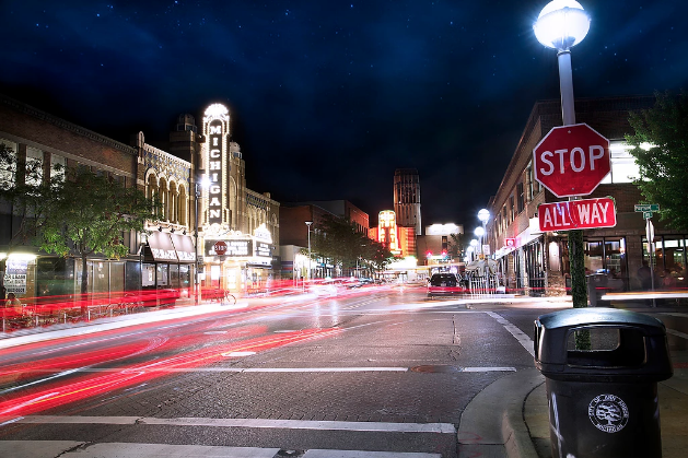
Eric Image 2 |
Recreated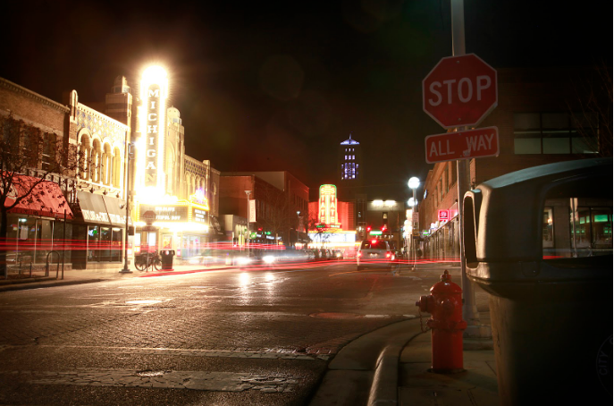
|
|
Recreated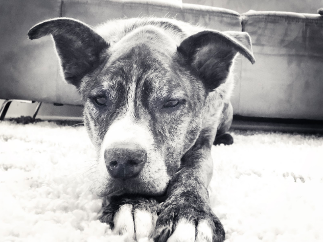
Recreated |
Eric Image 3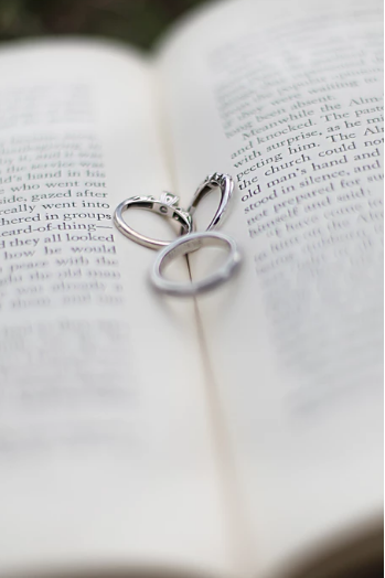
|
|
1. Eric Stamper was born in Garden City, MI on October 13, 1975. He lived in Westland, MI his whole childhood. At age 6, his parents divorced, and him and his sister Mandy lived with their mother and saw their father on the weekends. Eric attended John Glenn high school, played Varsity Baseball, and graduated. He went to college at the University of Michigan for 2 years in psychology before realizing he wanted to become a teacher and he transferred to Eastern Michigan University and got his masters degree in education psychology and became a teacher. He started photography in 2006 and has been doing it mostly in the summers for extra money, and and some fall and spring weddings.
2. Eric Stamper’s work captures weddings most of the time, and just by looking at the pictures, you have to feel happy for the people in the photo, even though I don’t know who they are. I can only imagine how happy I could feel if I actually knew those people. His best aspect of the photos on his website in my opinion is how he handles and adjusts the lighting in his photos to draw the human eye to wherever he wants it to look at. He also is very good at managing his background and what is in it, along with what the people are doing in each photo.
3. Eric Stamper’s photos are trying to express love and happiness. The majority of his photos have someone smiling or laughing with someone else. Others show people holding hands to show their love for one another. Other photos are more on the fun, cool side where he has people jumping over stuff or doing something and not even looking at the camera while having fun. I think his style of photography would appeal to couples who are getting married and need someone to capture their wedding.
4.This photographer has taught me how to get the best photos I can get. He helps me with lighting and what different kinds of lighting certain types of photos should have. He helps me with background noise. By looking into the background of one of his photos, I can easily see what a cool background should look like and when to just blur or make the background white. Finally, his website shows when to make something black and white and when to leave it in color based on the context of the image.
5. Sources: http://www.ericstamperphotography.com/portfolio?lightbox=image_2152 http://www.ericstamperphotography.com/?lightbox=image_myr
http://www.ericstamperphotography.com/portfolio?lightbox=image_60b
http://www.ericstamperphotography.com/
6. Image 1: He was able to have more light on the street in his photo because of the street light on the corner was on in his picture but not mine. His photo also has much less glare than mine, the michigan theater is much more crisp and more legible and mine has kind of an ugly glare to it. His photo is all around more crisp than mine, from the buildings to the street, and the letters. He was also able to get a lot more car streaks in the road, I did my photoshoot on a sunday night, so it wasn’t that busy, he did his a few years ago on a saturday night after a michigan game. In conclusion, I think my image turned out okay, but his is a much higher quality than mine.
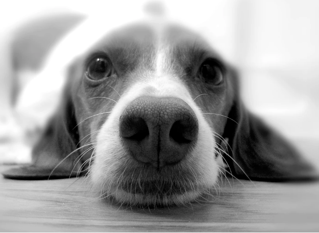
Image 2: His image is of a different dog however it is pretty similar to mine. His is one singular color, while mine has a couple different shades of lighter and darker. I like what the dog in his picture is doing but I couldn’t get my dog to do that. I also kind of like how the dog in his picture looks straight into the camera, but I also like how my dog is looking away. He blurred his background and looking back I feel I also should have done so as well. I like the white rug but I don’t like the couch in the background.
Image 3: His book is more white, which gives it a more traditional look to it, mine is a little more of a yellow book, so in the future I might want to use a different book. He also was able to blur everything except the focus, directing the eye has right to the focus of the image. I tried to replicate this but I was unable to quite get the same effect as he did. He put the bottom and top of the book in his picture to show of the spine of the book, I only got the top binding of the book in my photo. Finally, I don’t like how the bottom of my image has a dark spot on the book, because his doesn’t have it and it gives it a much more clean, crisp look to it.
2. Eric Stamper’s work captures weddings most of the time, and just by looking at the pictures, you have to feel happy for the people in the photo, even though I don’t know who they are. I can only imagine how happy I could feel if I actually knew those people. His best aspect of the photos on his website in my opinion is how he handles and adjusts the lighting in his photos to draw the human eye to wherever he wants it to look at. He also is very good at managing his background and what is in it, along with what the people are doing in each photo.
3. Eric Stamper’s photos are trying to express love and happiness. The majority of his photos have someone smiling or laughing with someone else. Others show people holding hands to show their love for one another. Other photos are more on the fun, cool side where he has people jumping over stuff or doing something and not even looking at the camera while having fun. I think his style of photography would appeal to couples who are getting married and need someone to capture their wedding.
4.This photographer has taught me how to get the best photos I can get. He helps me with lighting and what different kinds of lighting certain types of photos should have. He helps me with background noise. By looking into the background of one of his photos, I can easily see what a cool background should look like and when to just blur or make the background white. Finally, his website shows when to make something black and white and when to leave it in color based on the context of the image.
5. Sources: http://www.ericstamperphotography.com/portfolio?lightbox=image_2152 http://www.ericstamperphotography.com/?lightbox=image_myr
http://www.ericstamperphotography.com/portfolio?lightbox=image_60b
http://www.ericstamperphotography.com/
6. Image 1: He was able to have more light on the street in his photo because of the street light on the corner was on in his picture but not mine. His photo also has much less glare than mine, the michigan theater is much more crisp and more legible and mine has kind of an ugly glare to it. His photo is all around more crisp than mine, from the buildings to the street, and the letters. He was also able to get a lot more car streaks in the road, I did my photoshoot on a sunday night, so it wasn’t that busy, he did his a few years ago on a saturday night after a michigan game. In conclusion, I think my image turned out okay, but his is a much higher quality than mine.
Image 2: His image is of a different dog however it is pretty similar to mine. His is one singular color, while mine has a couple different shades of lighter and darker. I like what the dog in his picture is doing but I couldn’t get my dog to do that. I also kind of like how the dog in his picture looks straight into the camera, but I also like how my dog is looking away. He blurred his background and looking back I feel I also should have done so as well. I like the white rug but I don’t like the couch in the background.
Image 3: His book is more white, which gives it a more traditional look to it, mine is a little more of a yellow book, so in the future I might want to use a different book. He also was able to blur everything except the focus, directing the eye has right to the focus of the image. I tried to replicate this but I was unable to quite get the same effect as he did. He put the bottom and top of the book in his picture to show of the spine of the book, I only got the top binding of the book in my photo. Finally, I don’t like how the bottom of my image has a dark spot on the book, because his doesn’t have it and it gives it a much more clean, crisp look to it.
